


Chemist Warehouse has reported a 🔗 50% reduction in turnover because of COVID. People aren’t comfortable going into a store.
The goal is to boost their online presence and sales so that Chemist Warehouse goes from being ubiquitous on the roads to all over the World Wide Web.
Research found the online experience feels overwhelming. The website is just like the store, too crowded, except there isn't help from a chemist to help. The solution is to give people the trusted advice chemists' give with a feature that succinctly tells people the information they need so that they can make an informed decision when they purchase medication online—just like in the store!
Retail stores have been significantly affected by COVID and pushed people to shop online, so Chemist Warehouse wants to reduce risk and boost its online sales in the event of another lockdown.
The objective of our research plan is to understand people’s shopping habits/behaviours both online and in-store. We conducted 20 user interviews to find out:
1. Why is online or in-store their preferred shopping method?
2. How has COVID impacted their online and in-store shopping experience?
3. What are their experiences with the current Chemist Warehouse website?
1. Trust
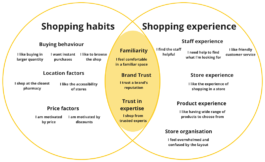
However people shop, there is an aspect of trust that informs their decision making. We found two distinct groups of people: people that shop based on the in-store experience and people with general shopping habits that shape how they shop. Sometimes they would overlap. These people like the experience of talking to a trusted expert and make a habit of it.

2. Website Experience
Jennifer put it well. People that aren’t tech-savvy find the website especially overwhelming because of the navigation and in-your-face branding. Chemist Warehouse put too much onto one page and it’s an overload to someone like Jennifer.
3. Online awareness
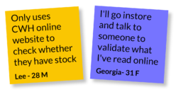
A significant amount of people only use the website to browse. These people prefer to ask questions in person and then purchase it there and then. They prefer the experience of shopping in person.
Through our research, we identified 2 main user archetypes—each with their own motivation, goals and pain points. The in-store shopper and the online shopper.


Online shopper
In-store shopper
There is a bigger opportunity in converting the in-store shopper into an online shopper. Focusing on in-store shoppers aligns with Chemist Warehouse’s business goals because it will boost their online presence and convert the loss of retail sales into e-commerce sales.
Clearly itemising the limitations of a product, what it’s used for, the active ingredient, what the side-effects are etc. will help the in-store shopper make an informed decision. It's the advice they look for when going into a store and it allows the user to compare multiple items in one screen.

It’s difficult, to say the least. Multiple browser tabs need to be open and the information is inconsistent between the three. Their marketing materials are all over the place, which makes it difficult to compare.
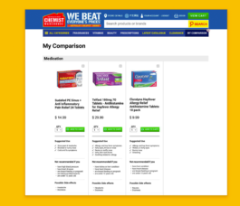
The new experience will solve that with an all-in-one window solution. We believe this feature will deliver the trusted information the in-store shopper needs to make an informed decision.
We tested users to determine whether they will be able to purchase the correct hayfever medication with zero errors. We’re aiming for 100% success. An error with hayfever medication is a waste of time, money and most importantly: health.
5 participants took part.
80% succeeded (1 failed)
When the participant thought of hayfever medication, he wasn’t focused on the label ‘hayfever’, but on the symptom: a running nose. Because they all treated a running nose he decided to remove the 70 pack since he wouldn’t need that many.
One usability test failed but during the test, we asked each participant “how would you start comparing these items?” and the most common method was to open up a tab for each item because “most websites don’t have this feature.”
5/5 test participants found this feature to be helpful.
This response gave the team resolve and reminded us why we’re creating this solution — to make the online experience easier.
One usability test failed because the participant was confused when comparing hayfever medication. We need to focus on a 100% success rate test more participants.
How do people make decisions when purchasing medication? We’ve conducted a survey (graph 1) to see what users look for, but we need to test whether this actually helps.

Does this solution instil a sense of trust? And more importantly, will this convert sales? Further testing is necessary.
1. The idea of slowly building things over time can be applied to many different products. You can do a lot with a little but it should be done in incremental steps.
2. Our initial vision was overly ambitious and idealistic because we tried to do too much in one feature, which diluted our solution. A measured hand is necessary to produce a minimum viable product.
3. Trust is hard to build and difficult to maintain. Overpromising and underdelivering will quickly kill trust. It must be slowly built upon over time.

I believe by starting here…

We can eventually get here.
Chemist Warehouse has reported a 🔗 50% reduction in turnover because of COVID. People aren’t comfortable going into a store.
The goal is to boost their online presence and sales so that Chemist Warehouse goes from being ubiquitous on the roads to all over the World Wide Web.
Research found the online experience feels overwhelming. The website is just like the store, too crowded, except there isn't help from a chemist to help. The solution is to give people the trusted advice chemists' give with a feature that succinctly tells people the information they need so that they can make an informed decision when they purchase medication online—just like in the store!

Retail stores have been significantly affected by COVID and pushed people to shop online, so Chemist Warehouse wants to reduce risk and boost its online sales in the event of another lockdown.
The objective of our research plan is to understand people’s shopping habits/behaviours both online and in-store. We conducted 20 user interviews to find out:
1. Why is online or in-store their preferred shopping method?
2. How has COVID impacted their online and in-store shopping experience?
3. What are their experiences with the current Chemist Warehouse website?
1. Trust
However people shop, there is an aspect of trust that informs their decision making. We found two distinct groups of people: people that shop based on the in-store experience and people with general shopping habits that shape how they shop. Sometimes they would overlap. These people like the experience of talking to a trusted expert and make a habit of it.

2. Website Experience
Jennifer put it well. People that aren’t tech-savvy find the website especially overwhelming because of the navigation and in-your-face branding. Chemist Warehouse put too much onto one page and it’s an overload to someone like Jennifer.

3. Online awareness
A significant amount of people only use the website to browse. These people prefer to ask questions in person and then purchase it there and then. They prefer the experience of shopping in person.

Through our research, we identified 2 main user archetypes—each with their own motivation, goals and pain points. The in-store shopper and the online shopper.

Online shopper

In-store shopper
There is a bigger opportunity in converting the in-store shopper into an online shopper. Focusing on in-store shoppers aligns with Chemist Warehouse’s business goals because it will boost their online presence and convert the loss of retail sales into e-commerce sales.
Clearly itemising the limitations of a product, what it’s used for, the active ingredient, what the side-effects are etc. will help the in-store shopper make an informed decision. It's the advice they look for when going into a store and it allows the user to compare multiple items in one screen.

It’s difficult, to say the least. Multiple browser tabs need to be open and the information is inconsistent between the three. Their marketing materials are all over the place, which makes it difficult to compare.

The new experience will solve that with an all-in-one window solution. We believe this feature will deliver the trusted information the in-store shopper needs to make an informed decision.
We tested users to determine whether they will be able to purchase the correct hayfever medication with zero errors. We’re aiming for 100% success. An error with hayfever medication is a waste of time, money and most importantly: health.
5 participants took part.
80% succeeded (1 failed)
When the participant thought of hayfever medication, he wasn’t focused on the label ‘hayfever’, but on the symptom: a running nose. Because they all treated a running nose he decided to remove the 70 pack since he wouldn’t need that many.
One usability test failed but during the test, we asked each participant “how would you start comparing these items?” and the most common method was to open up a tab for each item because “most websites don’t have this feature.”
5/5 test participants found this feature to be helpful.
This response gave the team resolve and reminded us why we’re creating this solution — to make the online experience easier.
One usability test failed because the participant was confused when comparing hayfever medication. We need to focus on a 100% success rate test more participants.
How do people make decisions when purchasing medication? We’ve conducted a survey (graph 1) to see what users look for, but we need to test whether this actually helps.

Does this solution instil a sense of trust? And more importantly, will this convert sales? Further testing is necessary.
1. The idea of slowly building things over time can be applied to many different products. You can do a lot with a little but it should be done in incremental steps.
2. Our initial vision was overly ambitious and idealistic because we tried to do too much in one feature, which diluted our solution. A measured hand is necessary to produce a minimum viable product.
3. Trust is hard to build and difficult to maintain. Overpromising and underdelivering will quickly kill trust. It must be slowly built upon over time.

I believe by starting here…

We can eventually get here.